Styling with Pastel Colours in Home Decore and Summer Living
As the seasons shift and the days grow longer, there's no better time to refresh your space and style with a softer, more serene palette.
As the seasons shift and the days grow longer, there's no better time to refresh your space and style with a softer, more serene palette. Enter pastel colours—those delicate, chalky tones that exude calm, charm, and effortless elegance. Whether you're looking to update your home decore or embrace a summer-ready aesthetic, pastels offer an easy, timeless way to breathe new life into any setting.
Gone are the days when pastels were reserved solely for nurseries or spring weddings. Today, these muted tones have found a firm place in contemporary design and fashion. From blush pink to mint green, powder blue to lavender, pastel shades can be styled to feel grown-up, chic, and fresh, all while promoting a sense of peace and positivity.
In this blog, we’ll explore how to use pastel colours effectively in your home interiors and summer lifestyle, whether you're looking to redecorate a room, entertain outdoors, or simply add a touch of seasonal charm to your wardrobe or table setting.
Why Choose Pastel Colours?
Before diving into the how, let’s explore the why. Pastels offer several aesthetic and emotional benefits that make them especially fitting for both home and summer styling:
- Calming effect: Light, muted tones are known to create a sense of tranquillity and openness.
- Timeless appeal: Unlike bold trends, pastels remain stylish year after year.
- Versatility: They complement a wide range of design styles—from Scandinavian minimalism to English country charm.
- Seasonal fit: Their soft, light-reflecting nature makes them ideal for summer, adding brightness without overwhelming warmth.
- Unobtrusive beauty: Perfect as a backdrop or a statement, pastels are effortlessly elegant.
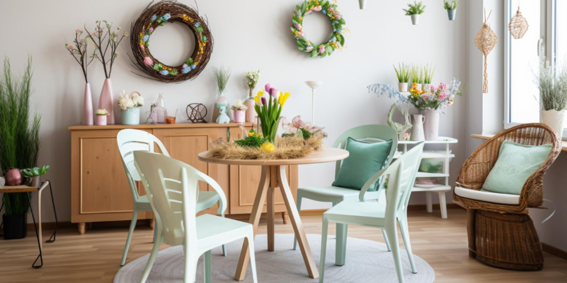
1. Pastels in Home Decore: Creating a Soft and Stylish Sanctuary
Bringing pastels into your home doesn’t mean painting every wall baby pink. With the right balance, these hues can add dimension, interest, and a soothing quality to your living space.
Walls and Paintwork
If you're ready for a bolder change, pastel wall paint is a beautiful alternative to stark white or beige. Consider:
- Pale sage or mint in a kitchen or bathroom for a clean, fresh feel.
- Blush pink in a bedroom or hallway for a romantic and welcoming touch.
- Soft lilac or sky blue in a living room or home office to promote calm and creativity.
For a modern twist, try half-painted walls or a pastel feature wall, paired with crisp whites or greys to keep the look sophisticated.
Furniture and Upholstery
Pastel-toned furniture pieces—like a pale yellow accent chair or a powder blue sofa—add visual interest without overwhelming the room. These hues work especially well in mid-century and modern minimalist interiors.
Don’t want to commit to large furniture pieces? Soft furnishings are the easiest way to incorporate pastels:
- Cushions in layered pastels (think blush, lavender, and cream)
- A mint-green throw draped over a neutral sofa
- Pale pink or duck-egg blue curtains for a subtle pop of colour
Accessories and Accents
Decorating with pastels doesn't have to mean a full room makeover. You can use small details to build up a cohesive palette:
- Ceramic vases, candle holders, or lampshades in dusty rose or light teal
- Pastel photo frames and art prints for gallery walls
- Woven baskets, rugs or trays in complementary hues
For a unified look, choose 2–3 pastel shades that harmonise and repeat them throughout the space in varying textures and materials.
2. Pastels for Summer Entertaining: Light, Fresh and Joyful
Pastel styling is a natural fit for summer garden parties, alfresco dining, and outdoor entertaining. Their soft tones mimic the colours of blooming flowers, clear skies, and refreshing sorbets—everything that defines the season.
Tablescapes and Dining
A pastel-themed table instantly elevates any summer gathering. Here’s how to style yours:
- Use a linen tablecloth in pale peach, powder blue or soft lemon.
- Mix and match pastel crockery or opt for white dishes with pastel napkins and cutlery.
- Add fresh flowers like peonies, hydrangeas, or roses in pinks, lavenders, and creams.
- Include coloured glassware or water jugs in frosted pastel finishes for a whimsical touch.
Don’t forget ambient lighting—pastel lanterns, fairy lights, or candles can enhance the dreamy atmosphere, especially for evening events.
Garden and Patio Styling
Even a small outdoor area can be transformed with pastel decore:
- Add pastel cushions to your patio seating for instant charm.
- Choose planters and pots in soft hues to highlight your greenery.
- Hang pastel bunting or fabric drapes for garden parties or BBQs.
- Invest in a pastel parasol or outdoor rug to create a shaded chill-out zone.
Pair pastel elements with natural textures like rattan, linen, and wood for a look that feels relaxed and grounded.
3. Pastel in Summer Fashion and Lifestyle
Beyond home decore, pastels are equally versatile and flattering in summer wardrobes and accessories. They reflect sunlight beautifully and offer a chic alternative to the usual brights and whites.
Summer Fashion Tips
- Start small with pastel accessories—sunglasses, sandals, scarves, or a crossbody bag.
- Pair a pastel blouse with jeans or white trousers for a fresh daytime look.
- Try pastel nail polish or light makeup tones (such as lilac eyeshadow or coral blush) for seasonal beauty updates.
- For a coordinated look, match two or three pastel tones—like peach and mint, or baby blue and blush pink.
Pastels look great on all skin tones, and mixing cool and warm shades adds dimension to your outfit.
Home Lifestyle Touches
Bring a pastel vibe into your daily routine with:
- Pastel bed linens and pyjamas for a dreamy sleep environment.
- Soft pastel notebooks, mugs or stationery to brighten your workspace.
- Scented candles or diffusers with pastel packaging, in fresh summer scents like lavender, lemon, or rose.
These small changes help reinforce a sense of calm and aesthetic harmony.
Balancing Pastels: How to Avoid Overdoing It
The secret to successful pastel styling is balance. Here are a few tips to keep the look fresh and not overly saccharine:
- Contrast with neutrals: Pair pastels with white, grey, beige, or natural wood tones to ground the palette.
- Add texture: Matte ceramics, linen, and brushed metal finishes stop pastels from feeling flat.
- Use black sparingly: A touch of black or dark charcoal can add depth and modernity to a pastel scheme.
- Mix with bolder shades: Pastels don’t have to be shy—pair them with deeper tones like emerald, terracotta or navy for a more sophisticated look.
Embrace the Soft Life
Pastel colours bring with them a sense of ease, comfort, and quiet sophistication—perfect for summer living and soothing home spaces. Whether you’re redecorating, hosting guests, or simply enjoying a slower pace of life, incorporating pastels helps you create environments that feel both stylish and serene.
So don’t be afraid to explore the world of soft colours. A pastel cushion here, a mint-green planter there—these small touches can make a big difference. With just a few changes, you can turn any space or setting into a refreshing, joyful celebration of summer and style.